Project
Market data,
as a wallpaper
Two renderings at 3840×2160, built from public market data. Nothing invented, nothing added afterwards: what you see is the structure itself.
python matplotlib public data 3840 × 2160 free to download
A quant spends the day looking at volatility surfaces and correlation matrices, almost always in purely utilitarian renderings. Yet these objects have a shape, and the shape means something. The exercise was to treat them as graphic objects in their own right, without ever smoothing or distorting what the data says.
The implied volatility surface

Two axes on the floor, strike and maturity. Height is the implied volatility read from option prices. The raised tip on the left is the skew: downside protection trades markedly richer than the symmetric upside. That is not a rendering artefact, it is the premium the market accepts to pay against a fall.
The sheet projected on the floor carries the same values as contour lines. It works as a reference: it shows where the surface is flat, meaning the market holds little opinion, and where it rears up.
The correlation map
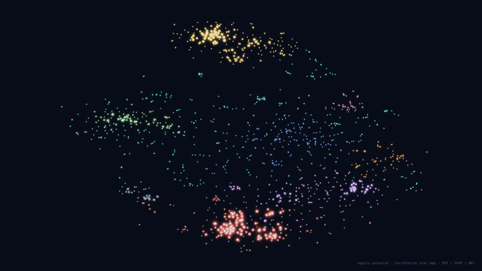
Each point is a constituent of the main US, European and Japanese indices. Distances come from the return correlation matrix: two names that move together end up close, two independent names drift apart. Colour marks the groups.
The interesting read is not where a single name sits but the shape of the clusters. A dense cluster flags a group that moves as one block, so diversification inside it is an illusion. The isolated points are the rare names that follow nobody.
Rendering constraints
A wallpaper has its own brief: it must stay readable under a row of icons, not tire the eye over eight hours, and do without a bulky legend. Hence the very dark ground, a single line of context in the bottom right, and a palette that stays muted except where the data deserves attention.
Both images are free to download at full resolution.